The Importance of Good Typography in Business Branding
Why does typography matter so much?
Claire Belling
2 min read
Typography is one of the most powerful yet often overlooked aspects of branding. It shapes how your business is perceived, influences readability, and helps establish a consistent brand identity. Whether you’re designing a logo, a website, or marketing materials, good typography can make all the difference.
So, why does typography matter so much for your business? Let’s break it down.
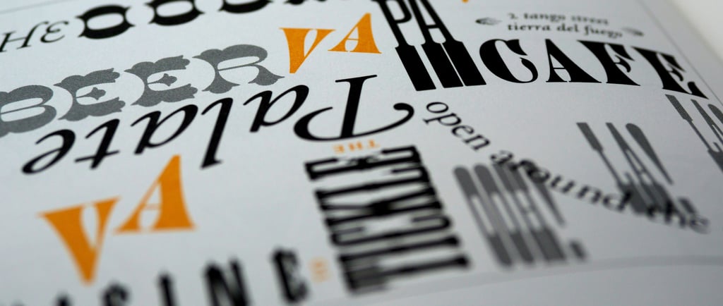
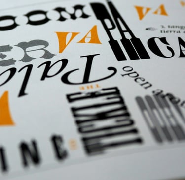
1. Typography Sets the Tone of Your Brand
You may have already noticed that fonts have personalities. The typeface you choose conveys a message before anyone even reads the words.
Examples:
Serif fonts (e.g., Times New Roman, Garamond) suggest tradition, trustworthiness, and professionalism.
Sans-serif fonts (e.g., Helvetica, Arial) are modern, clean, and minimalistic.
Script fonts (e.g., Brush Script, Pacifico) feel elegant, creative, or playful.
Display fonts (e.g., Impact, Bebas Neue) are bold, attention-grabbing, and great for headlines.
When selecting fonts for your brand, make sure they align with your business’s personality and values.
2. Readability is Key
Even the most beautifully designed brand materials will fail if people can’t read them.
Best practices for readability:
Choose fonts that are easy to read across different mediums (print, digital, signage, etc.).
Avoid using too many different fonts—stick to a primary and secondary font.
Ensure there’s enough contrast between text and background colours.
Use appropriate line spacing and letter spacing to enhance legibility.
3. Consistency Builds Recognition
Strong branding relies on consistency, and typography plays a crucial role in that.
How to maintain typography consistency:
Use the same fonts across your website, social media, business cards, and other materials.
Create a brand style guide with specific font rules.
Avoid switching fonts randomly—it can make your brand look unprofessional.
4. Typography Impacts Emotional Response
Typography isn’t just about aesthetics; it influences how people feel about your brand.
Examples of typography psychology:
Bold, capitalised text can create urgency and excitement.
Rounded fonts feel friendly and approachable.
Thin, elegant fonts can communicate luxury and sophistication.
Think about the emotions you want to evoke in your audience and choose fonts accordingly.
5. Mobile and Web-Friendly Typography Matters
If your business has a website or digital presence (which it should!), you need web-friendly typography.
What to consider for digital typography:
Use web-safe fonts to ensure compatibility across devices.
Avoid script fonts for body text—they’re hard to read on screens.
Make sure text is responsive and scales well on mobile devices.
6. Bad Typography Can Harm Your Brand
Poor font choices can make your business look unprofessional or even untrustworthy.
Common typography mistakes to avoid:
Using too many different fonts, making designs look chaotic.
Choosing overly decorative fonts that are hard to read.
Failing to adjust line spacing, leading to cramped text.
Final Thoughts
Typography is a powerful branding tool that can make or break your business’s visual identity. Choosing the right fonts, maintaining consistency, and prioritising readability will help your brand stand out and leave a lasting impression.
If you’re unsure about the best typography for your brand, let’s chat—I’d love to help! 😊
NEXT POST