Cross Market Operational Resilience Group (CMORG)


BRAND IDENTITY
Using:
THE BRIEF
The Cross Market Operational Resilience Group (CMORG) required a new brand identity that reflected their position as a critical player in the financial sector's resilience efforts. The identity needed to convey authority, collaboration, and focus across a range of professional materials.


THE PROCESS
I began by researching the organisation's strategic role and competitive landscape to identify opportunities for distinctive positioning. Workshops with key stakeholders revealed the importance of communicating both stability and progressive thinking within the identity.
Multiple concept directions were developed and refined, with focus groups providing feedback on how effectively each communicated the organisation's core mission and values.
THE SOLUTION
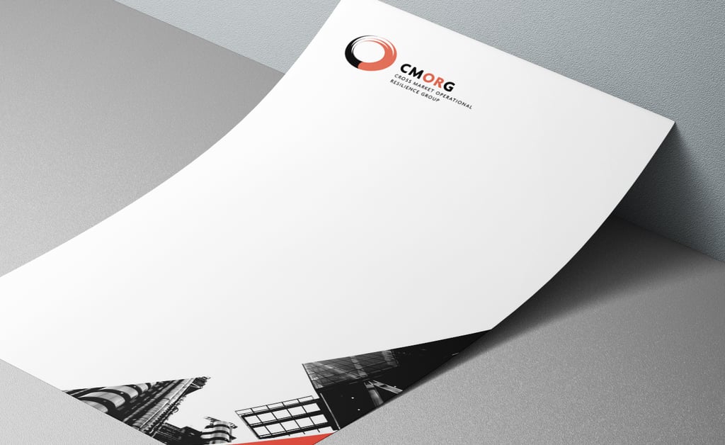
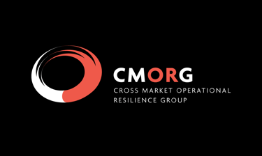
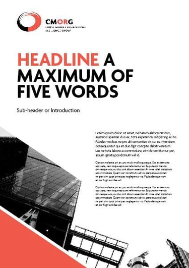
I developed a concept centred on CMORG's role as the 'strategic focal point' of operational resilience. The circular logo, with its bold red accent, symbolised unity, importance, and clarity while creating a distinctive visual mark for the organisation.
The comprehensive identity system included:
Complete logo pack with variations for different applications
Curated image library reflecting the organisation's themes and values
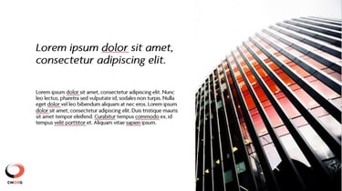
PowerPoint templates optimised for data presentation and clarity
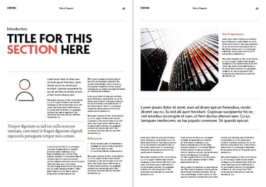
InDesign report templates ensuring consistent communication
Large-format conference materials including banners and signage
THE RESULTS
The new brand identity delivered multiple benefits to CMORG:
Established a professional, authoritative presence in the financial sector
Created visual cohesion across diverse communications and platforms
Enhanced recognition among key stakeholders and partners
Provided a flexible system that could adapt to evolving organisational needs
Supported the launch of their first dedicated website with consistent visual language
The strategic focal point concept successfully communicated CMORG's essential role while providing a distinctive visual identity that stood out in the financial services sector.


NEXT